July 7, 2023
 The Ultimate Guide to Android and iOS UI/UX Design
Introduction
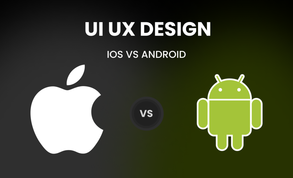
The two most dominant pioneers of the mobile domain: Android and iOS, are also known to be rivals when it comes to mobile app UI and UX design. However, despite their competitive nature, both Android and iOS have managed to consistently push the boundaries of mobile app UI design, inspiring each other to new heights of innovation. From sleek minimalist designs to bold and vibrant color schemes, these two have proven time and time again that they are at the forefront of mobile app design. Their commitment to creating user-friendly interfaces that are both intuitive and visually appealing has revolutionized the way we interact with our mobile devices.
With each new release, Android and iOS continue to challenge one another to create even more innovative designs that push the limits of what is possible in mobile app UI and UX design.
As we move forward into the future of mobile technology, it will be exciting to see how these two giants will continue to inspire and influence one another in their quest for unparalleled innovation in mobile app design. Let’s understand how Android and iOS UI and UX designs differ from each other.
Platform Guidelines and Design Language:
Material Design for Android
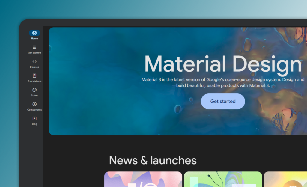
- Android follows the Material Design Guidelines that emphasize depth, vibrant colors, and responsive interactions.
- This UI and UX design approach creates a cohesive, intuitive user experience, making navigating and interacting with the user interface easy.
- Additionally, the use of animations and transitions adds a touch of personality and delight to the overall experience.
Drawback
- Overall, it can be challenging for developers and UI/UX designers to balance the standardization of the Android design language with the need to maintain a unique brand identity for their apps.
- Customization and consistency can require extra effort leading to delays in project timeline.
Human Interface Guidelines for iOS
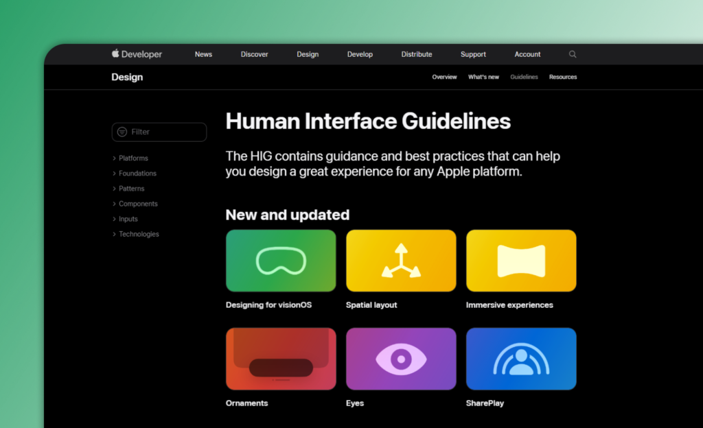
- iOS adheres to the Human Interface Guidelines (HIG), prioritizing simplicity and clarity.
- This is why iOS features a minimalist UI and UX design with clean lines, simple icons, and a limited color palette.
- Additionally, iOS prioritizes clarity by using plain language and avoiding jargon or confusing terminology.
- This approach ensures that users can easily understand and navigate the interface, regardless of their level of technical illiteracy
Drawback
- iOS guidelines aim for consistency, ease of use, but can limit designers’ creative expression.
- This can be frustrating for those seeking a more unique visual style, as the guidelines prioritize function over form.
Navigation Patterns:
Dynamic Navigation Patterns in Android
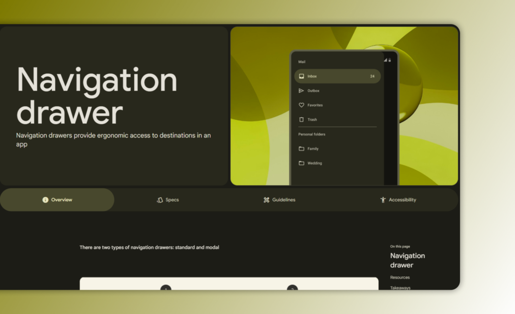
- The navigation drawer and bottom navigation bar are two popular options for primary navigation on Android.
- The navigation drawer is a sliding panel that appears on the left edge of the screen and displays a list of app options.
- On the other hand, the bottom navigation bar is a row of icons at the bottom of the screen that provides quick access to different parts of the app.
- Both options provide an intuitive way for users to navigate through an app, and developers can choose which one best suits their needs based on their app’s design and functionality.
Drawback
- It can consume screen space, which may result in complex navigation if not properly organized, and can vary across Android versions and device manufacturers.
- In today’s digital age, screen space is a precious commodity.
- It’s important to be mindful of how much space your app is taking up on a user’s device.
- It’s important to strike a balance between utilizing screen space effectively and maintaining ease of use, which is key to creating a successful app.
Streamlined Navigation Patterns in iOS
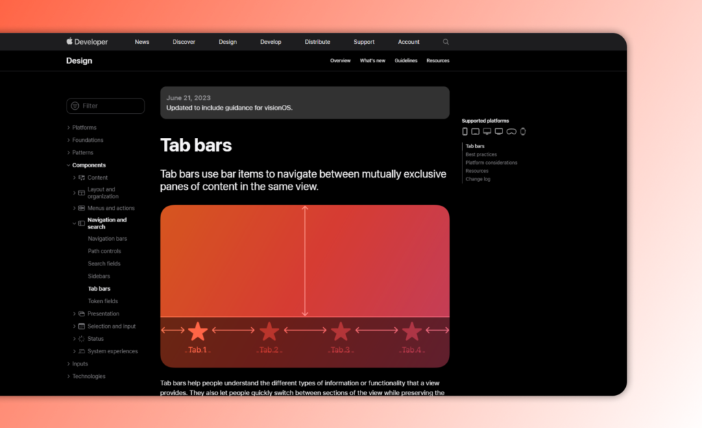
Tab bars: iOS emphasizes tab bars at the bottom or top for core navigation elements, providing quick access to primary app sections.
- Tab bars provide users with a way to access different sections of an app, without the need for complex menus or hidden navigation options.
- Tab bars are also customizable, allowing developers to add or remove tabs based on user feedback and usage data.
- iOS tab bars often feature icons and labels that make it easy for users to identify which section they are navigating to.
- This makes it easier for users to find what they are looking for, and encourages them to explore more of the app’s content.
- Also, tab bars can be customized to match the overall design aesthetic of an app, making them a versatile tool for UI and UX designers.
Drawback:
- One potential drawback of tab bars is that they can become cluttered or overwhelming if too many options are included.
- To avoid this, developers should carefully consider which sections of their app are most important and prioritize those in the tab bar.
- This can be frustrating for users who prefer quick and easy access to all navigation options.
Screen sizes and resolutions:
Diverse Dimensions in Android
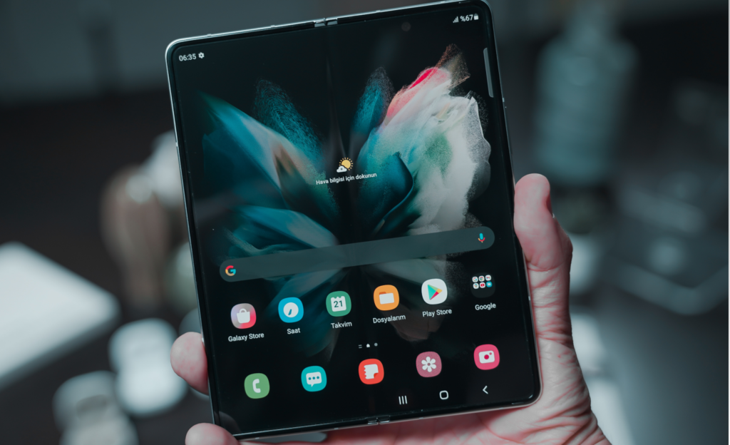
- Android comes in a wide range of screen sizes, including small phones, large phablets, and tablets.
- The flexibility in screen size allows designers to experiment different layouts and visual elements.
- They can create their own skins and themes, or even modify the core operating system to suit their client’s needs.
- This has led to a vibrant ecosystem of third-party apps and tools that extend the functionality of Android devices.
Drawback
- Designing for multiple screen sizes requires additional effort.
- Testing is important to ensure that the user experience remains consistent across all devices.
- This includes testing for usability, functionality, and visual appeal. It is time consuming for UI and UX designers to consider the varying screen sizes and resolutions of each devices when designing user interfaces.
Consistent Crafting in iOS
- Apple has consistently strived to provide users with visually stunning displays that enhance usability.
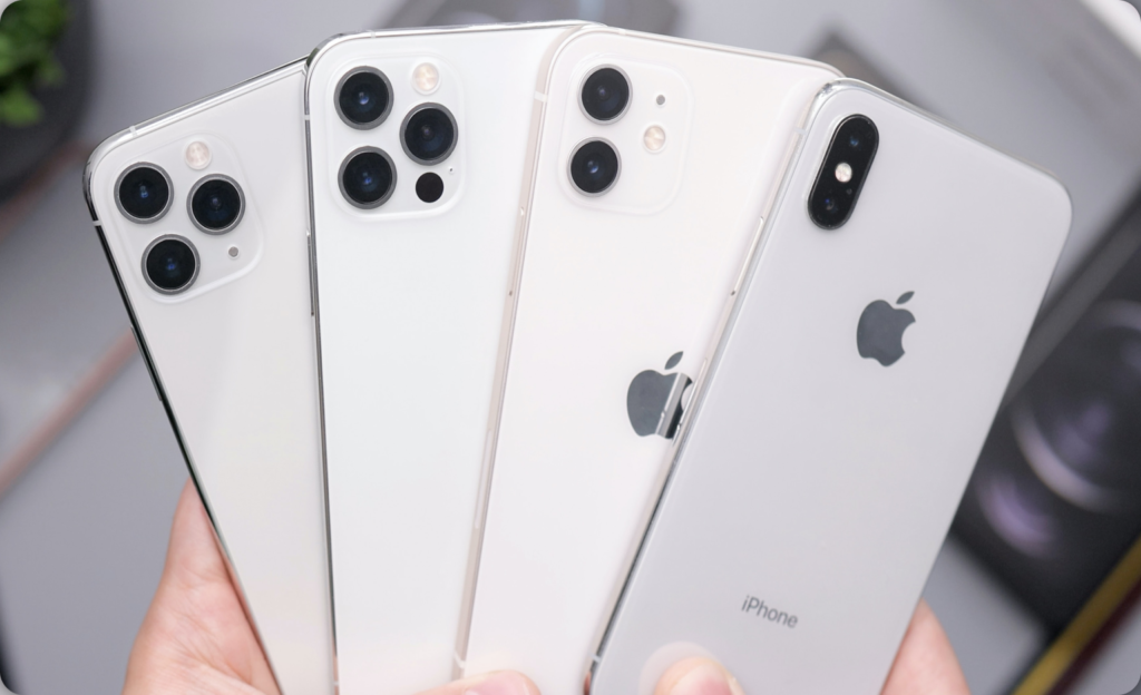
- The screen sizes across different iOS devices vary, ranging from the compact 4-inch display of the iPhone SE to the expansive 12.9-inch display of the iPad Pro.
- These high-resolution screens ensure that every detail is crisp and vibrant, resulting in an immersive visual experience by ux and ui designers.
- Additionally, iOS provides a more streamlined and consistent UI/UX experience because of its limited screen options.
Drawback
- The designing for older iPhone models with smaller screens and lower resolutions may require careful optimization without compromising on visual quality.
- Newer iPhone models such as; iPhone13, iPhone 14 Pro Max with larger screen sizes present challenges for UI and UX designers.
- It allows for more content and interactions, but they also require careful planning to ensure that items are correctly sized and positioned for the optimal usability.
Typography and Iconography:
Expressive Elements in Android
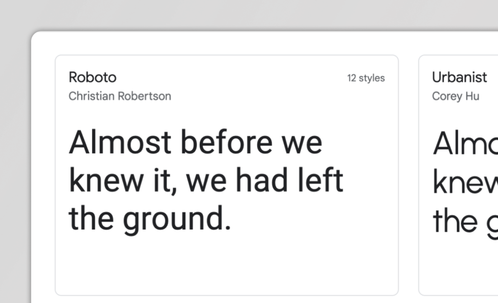
- The typographic options and expressive iconography provide users with a wide range of customization options.
- The ability to use custom fonts can allow users to truly make their devices their own by selecting a font that speaks to their personal style.
- The diverse icon styles available allow for greater brand expression and flexibility in typography choices.
- Android has options to suit your needs whether you prefer a minimalist design or something more intricate.
Drawback
- Android provides default system icons that are often generic and may not align perfectly with specific branding preferences.
- The Android devices come with a predefined set of system fonts, which may not include a wide range of typefaces.
- The UI and UX designers have to rely on these default fonts, which can limit their ability to match specific branding preferences.
Elegant Embrace in iOS
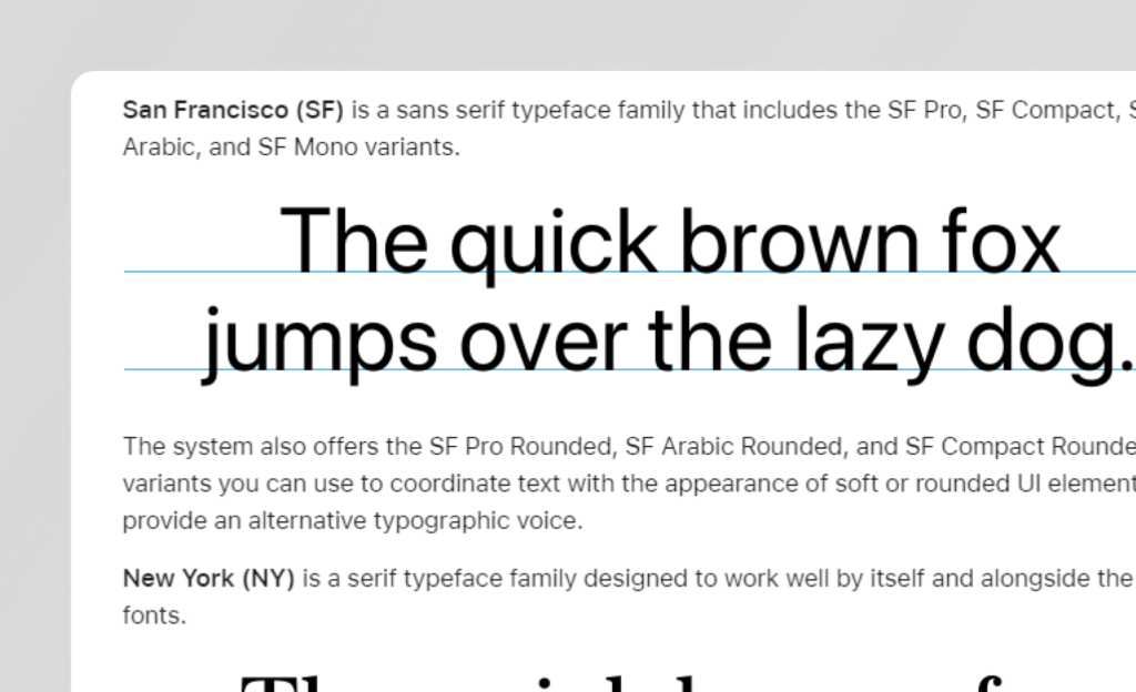
- iOS, with its clean and minimalist design approach, gives clarity to typography and iconography.
- Apple has developed its own font called San Francisco, which is specifically designed for optimal readability on various Apple devices.
- Regarding iconography, iOS icons are known for their simplicity as well as uniformity.
- The UI and UX designers are encouraged to adhere to Apple’s guidelines i,e designing their own icons, interfaces which helps maintain consistency throughout the platform.
Drawback
- iOS provides a set of predefined fonts, icons that UI and UX designers can use, but there is limited flexibility in terms of modifying these elements to suit the specific needs of an app.
- The lack of flexibility in terms of app layouts and designs can make it difficult to create a cohesive and distinctive user interface.
- Despite all this, iOS still stands out from the crowd with its sleek design, intuitive interface, and seamless integration.
Notifications and system integration:
Robust Notifications & System Integration in Android
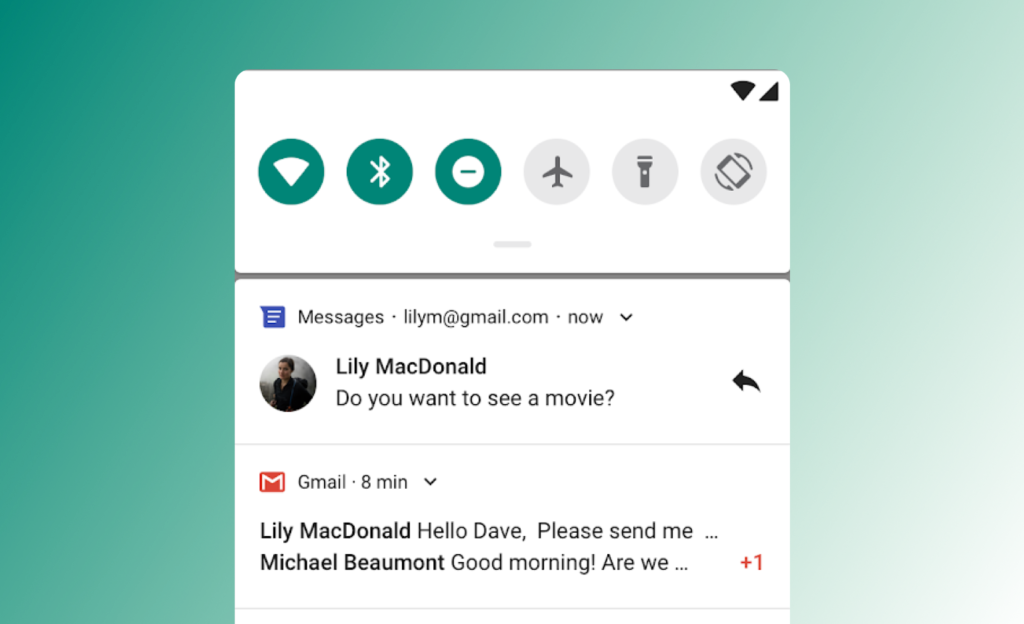
- Android customization allows users to prioritize notifications, ensuring that important messages are never missed.
- It offers interactive, actionable notifications for quick responses, tasks completion which also becomes easy for UI and UX designing.
- Android app streamlines workflow, keeps connected, ensures productivity by keeping messages updated.
- This feature aids on-the-go productivity by enabling quick business management without disrupting workflow.
Drawback
- Balancing customization and simplicity is crucial for user experiences, as over-customization can cause confusion and frustration.
- The notification system can become overwhelming if not properly managed, leading to a cluttered and confusing user interface.
- It is crucial to provide clear and concise options that are easy to navigate and understand. B users can have greater control over their experience without sacrificing usability or coherence.
Seamless Harmony in iOS
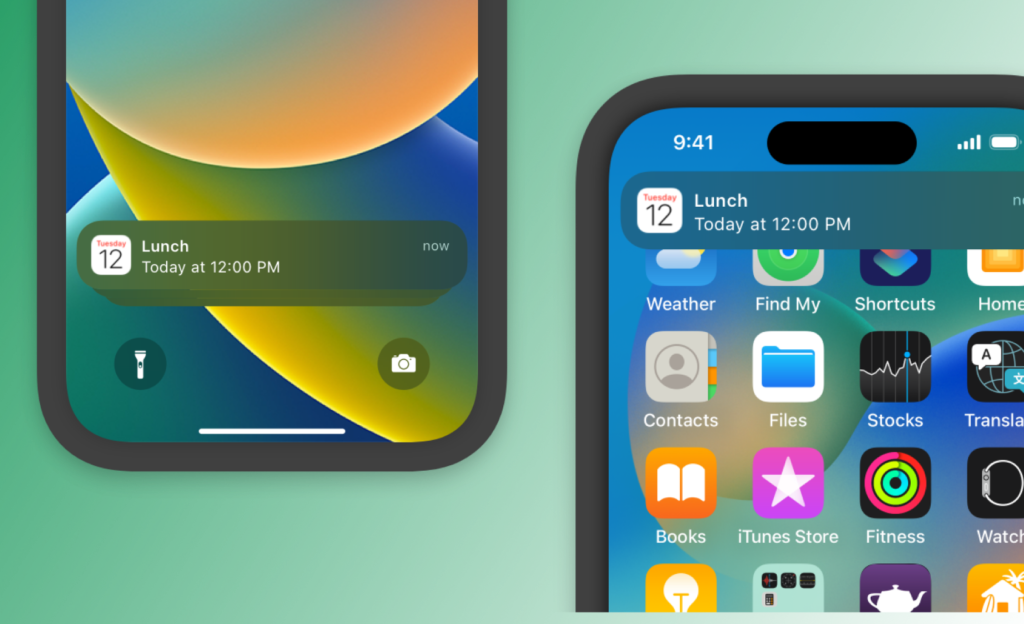
- iOS UI/UX design prioritizes a clutter-free notification experience, providing fine-grained control over notification settings.
- It maintains a focus on privacy and user control, offering a more streamlined approach to notifications.
- Users can easily manage which apps can send notifications as well as choose to have them delivered quietly or turned off completely.
- With iOS, users can also group notifications by app or thread, making it easier to keep track of important messages and updates.
Drawback
- Apple prioritizes users’ privacy and security, requiring developers to follow strict guidelines when it comes to collecting and using data.
- Additionally, the stricter review process for apps’ notification usage can impact certain functionalities.
- iOS places restrictions on how apps can interact with system features and resources. This can limit the integration possibilities for certain functionalities, such as deep system-level integration or accessing certain device sensors or settings.
While iOS’s restrictions can be challenging for developers as well as UI/UX designers, they ultimately help both users and the app ecosystem as a whole.
Conclusion
The bottom line is that there is no winner between iOS and Android. The decision boils down to whether one values simplicity and uniformity or diversity and adaptability.
It ultimately comes down to personal preference and what features and functionality are most important to each individual user. Both operating systems have their strengths and weaknesses, and it’s up to the user to decide which one best suits their needs.
We at Nextsavy Technologies are tailored to meet your specific needs. Our team of experienced ux/ui designers is well-versed in the latest technologies and trends, ensuring that your application is not only visually appealing but also highly functional. From concept to deployment, we handle every aspect of the development process with utmost professionalism and attention to detail. Whether you need a simple app for your business or a complex solution for a large-scale project, we have the expertise to deliver exceptional results.
Contact us for all your Android or iOS app development needs, and let us turn your vision into reality.
 7 minutes